Case Studies
When reports are long, arguments are technical, or research is data-heavy, design can be the difference between research that is skimmed and research that is actually used.
Our work reduces reader fatigue, clarifies arguments, and produces assets that can be reused across publications, presentations, and social media, meaning that your work carries further, reaches the right audiences, and does not get lost in its own complexity.
Data Visualisation and Graphics
Fatal violent incidents in Mexico (2019–2025)
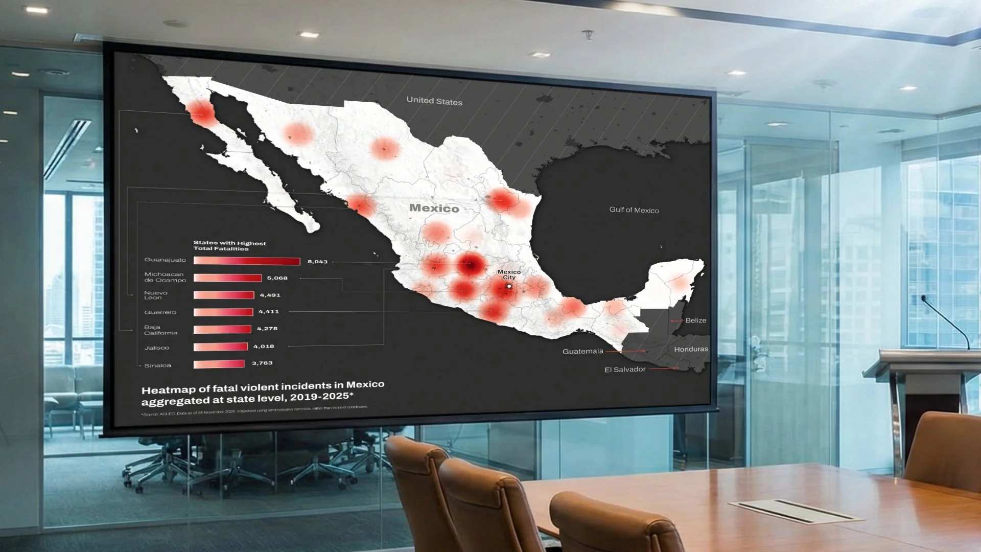
Client information withheld
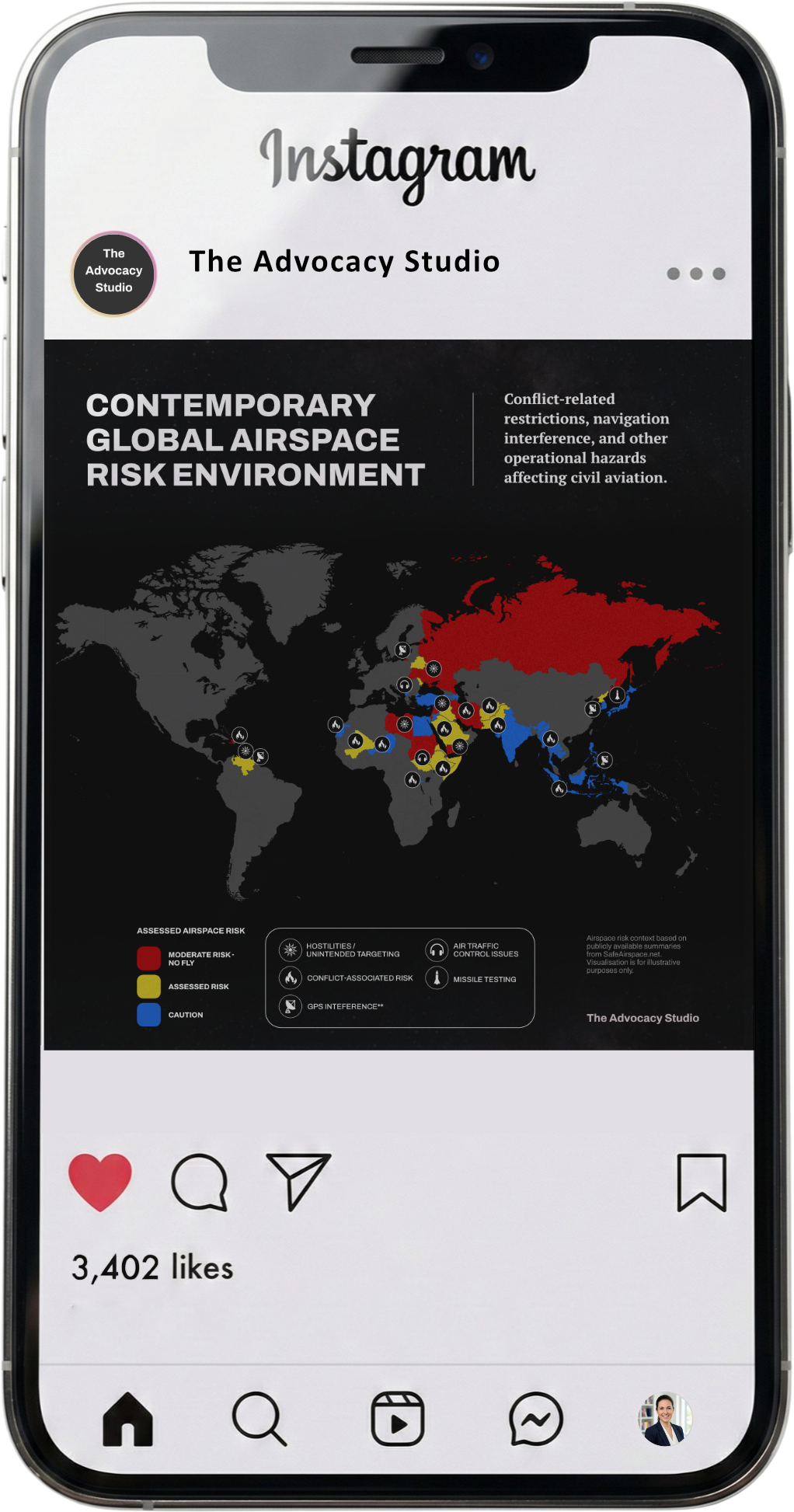
Violence in Mexico is frequently discussed through headline figures, isolated incidents, or year-by-year statistics, making it difficult to grasp longer-term spatial patterns at national scale.
Context
The client required a way to communicate how fatal violence is distributed across the country over time, in a form that could be understood quickly by policymakers, advocates, and non-specialist audiences. Existing representations either relied on dense tables or implied a level of geographic precision that was not appropriate for advocacy use.
Problem to be solved
The heatmap aggregates multi-year data at state level to reveal relative concentration and national patterns. It enables rapid situational understanding for briefings, advocacy, and public communication, and functions as a reusable visual asset across reports, presentations, and digital platforms.
Outcome and value to client
The Environmental Impact of
West Bank Settlements
Norwegian Refugee Council
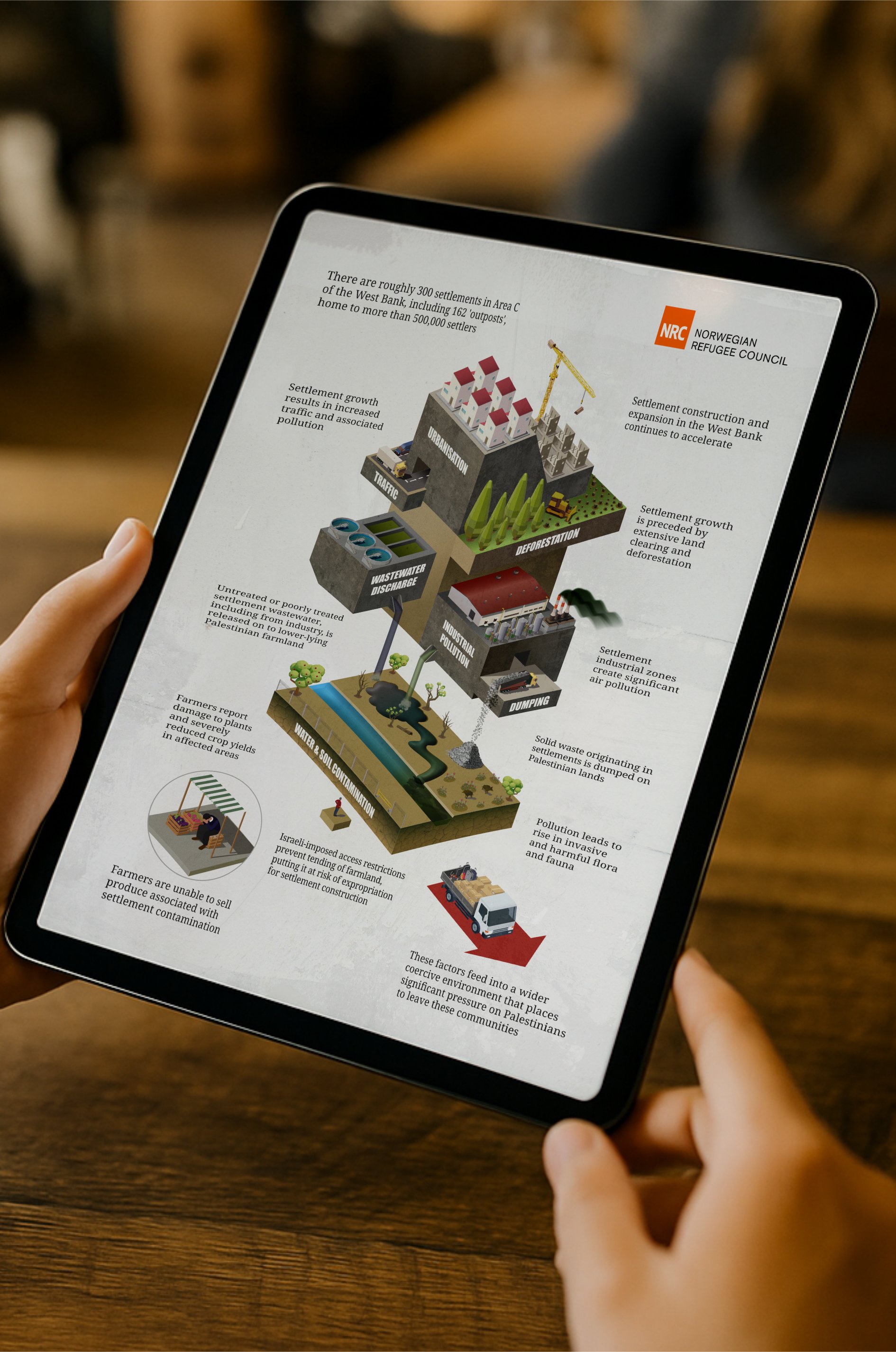
Settlement expansion in the West Bank produces a wide range of environmental, economic, and social impacts that are typically documented through separate thematic lenses.
Context
The Norwegian Refugee Council required a means of explaining how these different impacts interact and accumulate over time, rather than being perceived as disconnected issues. In particular, a graphic was required for inclusion in a long-form report, providing readers with a clear, navigable visual framework through which the accompanying analysis could be readily understood and cross-referenced.
Problem to be solved
This isometric system diagram integrates multiple harmful policies and practices into a single, impactful visual framework, making an abstract concept immediately accessible and legible to a wide range of audiences.
Outcome and value to client
Gaza’s Cash Liquidity Crisis
Norwegian Refugee Council
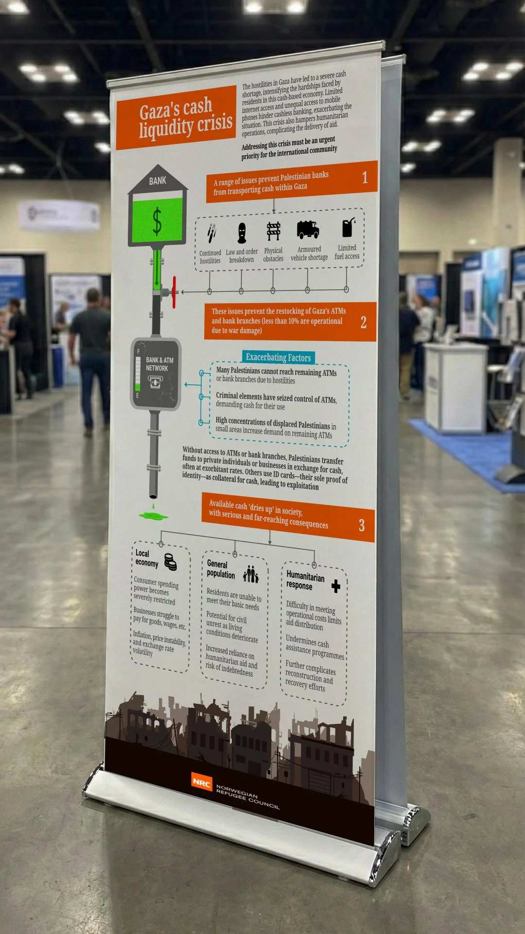
Hostilities in Gaza generated an acute cash shortage in a largely cash-based economy, with significant consequences for civilians, markets, and humanitarian operations.
Context
The Norwegian Refugee Council urgently required a clear explanation of why cash availability had collapsed and how multiple constraints were interacting. The challenge was to produce a visual narrative that policy audiences and donors could grasp quickly while still reflecting the complexity of the situation.
Problem to be solved
The graphic maps the causal chain from upstream constraints to downstream economic and humanitarian effects, including second- and third-order impacts.
It supports advocacy and decision-making by clarifying how liquidity constraints affect civilian life and humanitarian response, and provides a concise visual tool suitable for briefings, reports, and external communication.
Outcome and value to client
Report Design
80+ humanitarian, development and human rights organisations
Long-form report on settlement trade
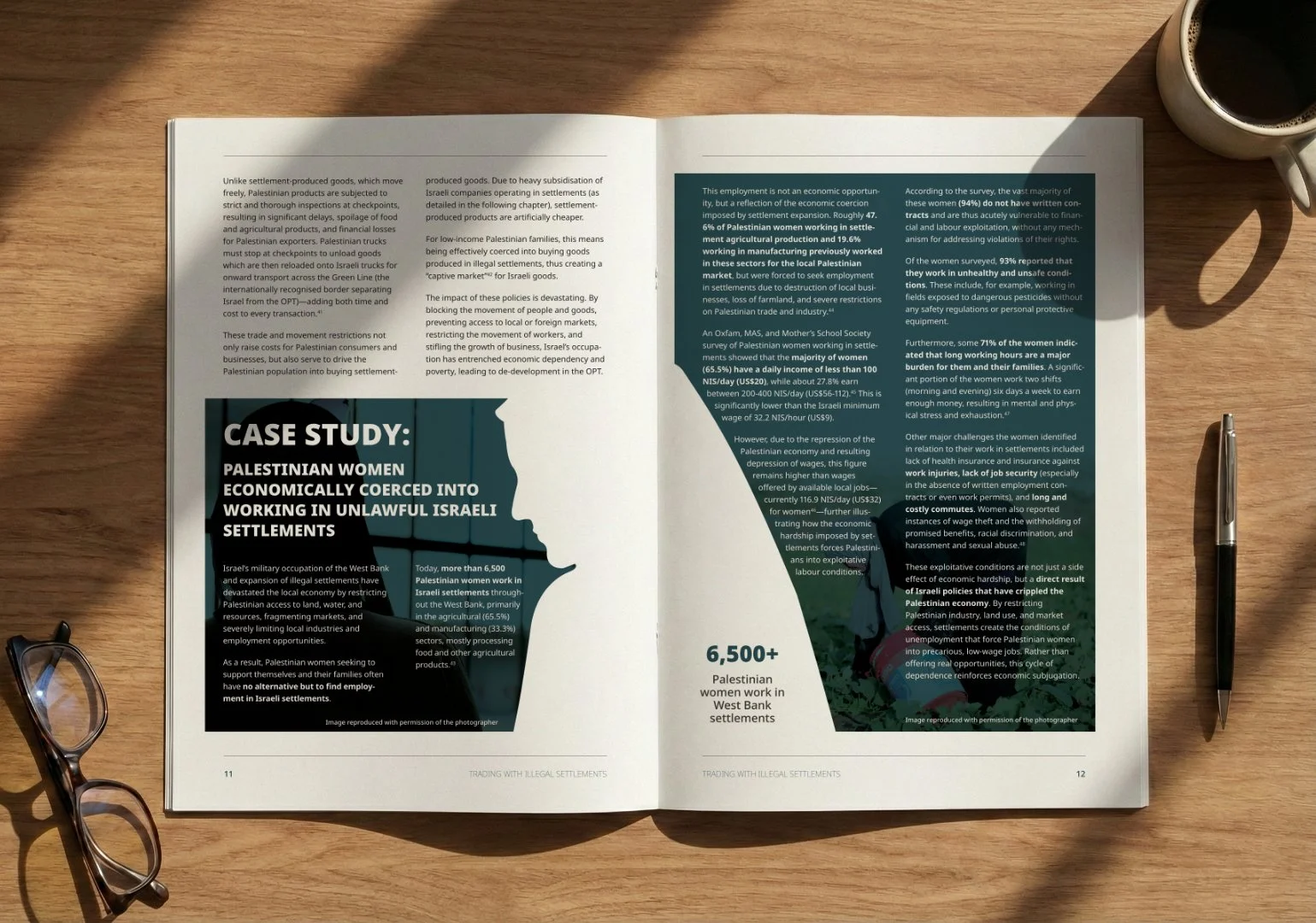
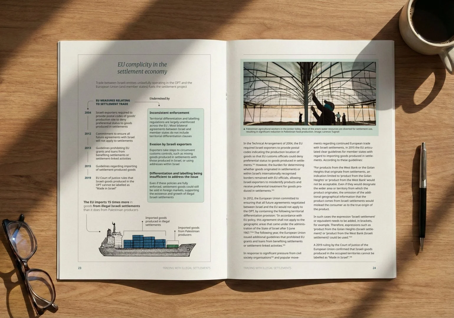
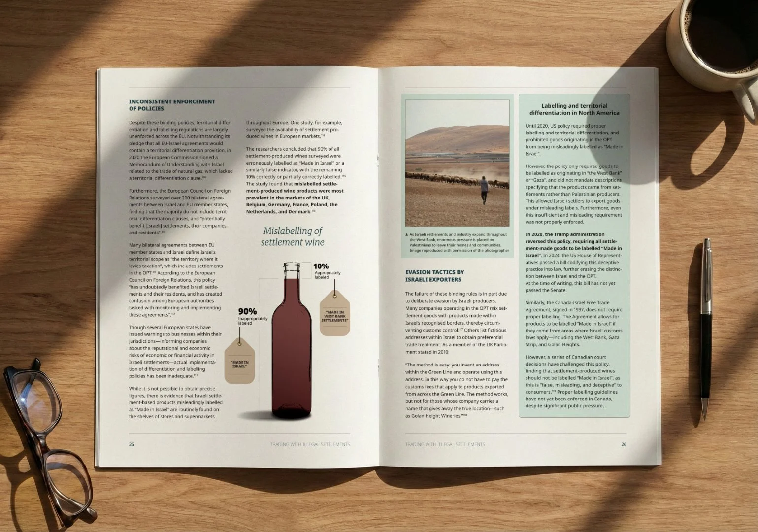
Long-form legal and policy reports remain a primary tool for advocacy and policy engagement, but are often read under time pressure by policymakers, donors, and communications teams. At lengths of fifty pages or more, such reports are rarely read cover to cover and must function across multiple use cases, including briefing, selective reference, and external communication.
Context
The clients required design and visual support for a 50-page policy report. The scale and density of the text made it difficult for readers to navigate the argument and maintain orientation across chapters, as well as inviting reader fatigue. The challenge was to use visual structure and graphics to promote engagement with the report’s contents and to significantly broaden its potential audience.
Problem to be solved
The design introduces clear structure and visual hierarchy across a fifty-page report, making dense analysis easier to navigate and use. Graphics break up long text, signal key arguments, and support different reading behaviours, from skimming to detailed review. Each visual was also designed to function as a standalone asset, allowing the work to be reused directly in communications and social media to extend the report’s reach.
Outcome and value to client
Institutional Commissions
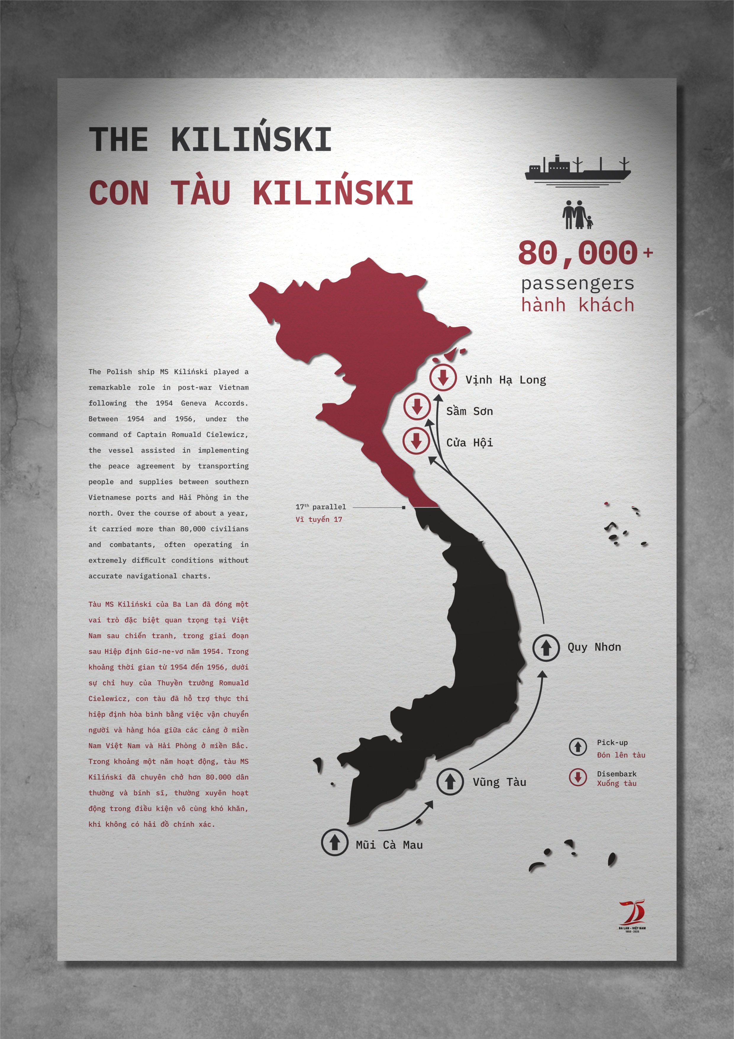
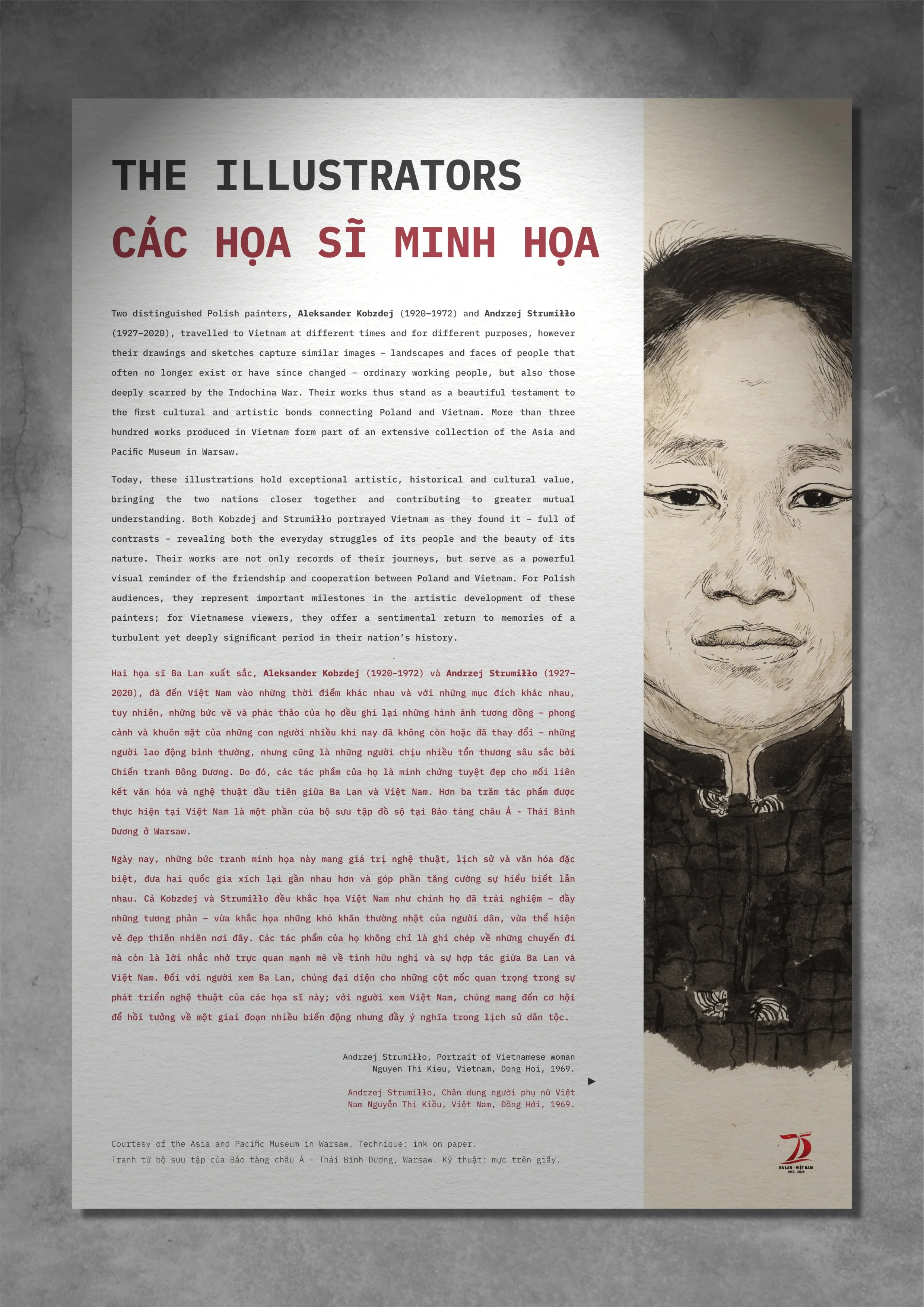
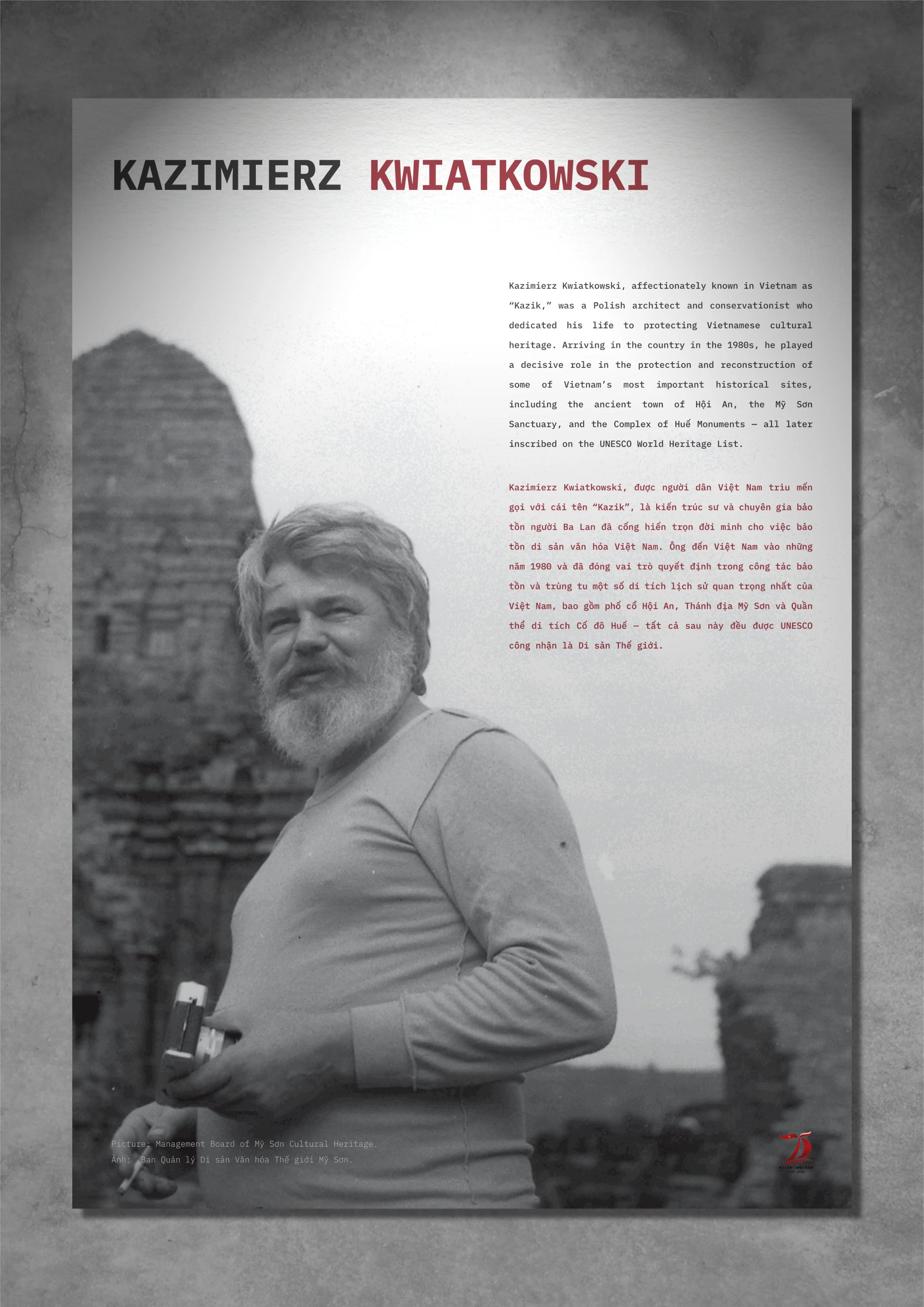
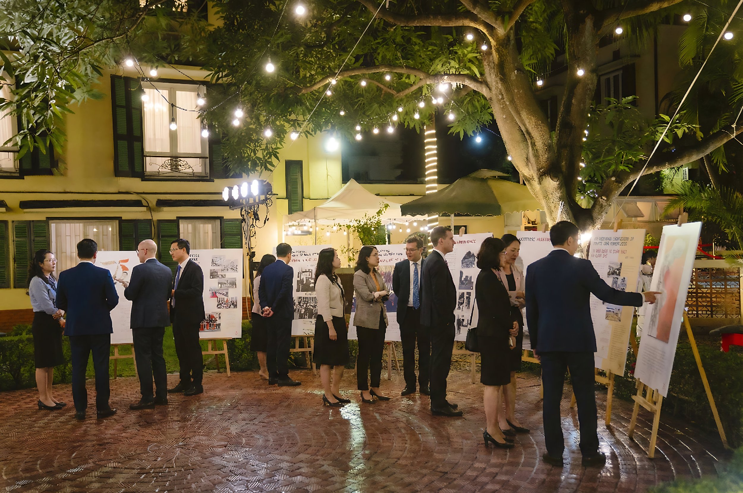
Exhibition marking seventy-five years of diplomatic relations between Poland and Vietnam
Embassy of the Republic of Poland in Hanoi
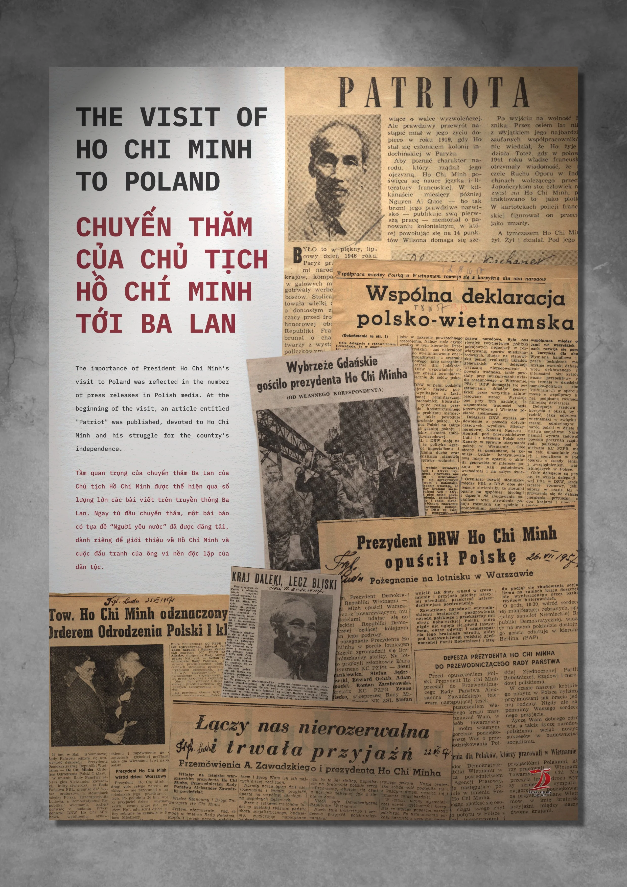
Context
The Embassy of the Republic of Poland in Hanoi commissioned a public exhibition to mark the seventy-fifth anniversary of diplomatic relations between Poland and Vietnam.
The Embassy required archival material and historical narratives to be presented in a public exhibition format suitable for a formal diplomatic context. The content needed to be accessible to a general audience while maintaining institutional tone, historical accuracy, and diplomatic sensitivity, and to function bilingually. The exhibition had to guide visitors through complex bilateral history in a way that was legible at a glance and appropriate for a state-level public setting.
Problem to be solved
Twenty-three A0 panels were used to turn a large volume of archival material into an exhibition that people would actually stop, read, and move through. An overall visual identity tied the panels together, but with separate themes utilising different layouts to avoid a feeling a repetition. For the Embassy, this meant archival material was presented in a way that felt contemporary and engaging, while still appropriate for a formal diplomatic setting and usable beyond the exhibition itself.